Nav Bar

Navigate to Customize > Header > Navbar to access navbar options.
Buttons
- Show Search – Search
- Show Shopping Cart – WooCommerce Cart
- Show Login – Login icon
- Show CTA Button – Call to action button
Responsive Settings
- Auto Compress – Automatically trigger mobile layout if there’s no enough space to display all items
- More Dropdown – Move menu items to more dropdown if there’s no enough space to display all items
- Mobile Breakpoint – Screen width at which the mobile layout is triggered
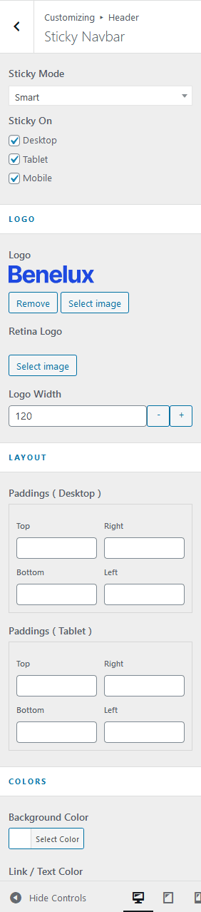
Sticky Navbar
Navigate to Customize > Header > Sticky Navbar to access sticky navbar options.
- Sticky Mode
- Disable – Disable sticky navbar
- Always – Always stick to the top
- Smart – Hides the navbar while scrolling down the page and shows it scrolling up.
- Sticky On – sticky mode can be switched on/off separately based on screen width.
- Desktop – ( > 1024px )
- Tablet – ( 768px — 1024px )
- Mobile ( < 768px )
- Logo – logo displayed only when sticky navbar is active, default logo will be used if logo is unset.
- Retina Logo – 2x size of logo
- Logo Width – logo width